DESCRIPTION
For this project, I designed and developed my own portfolio website to showcase my skills and growth this semester. The goal was to create something that not only looked professional but also reflected my personality and design style. I started by collecting inspiration from Pinterest and creating a mood board to define the visual direction I wanted.
GOAL
My main goal was to design a creative and functional website that presents my work clearly and shows my progress as a designer. I wanted it to be visually appealing, easy to navigate, and to represent who I am as a student at Fontys.
REFLECTION
This project helped me understand how much iteration and feedback can improve a design. At first, I thought my layout was fine, but hearing different opinions showed me how small changes — like background color or layout adjustments — can make a big difference. I learned how to take constructive feedback, try new ideas, and find what actually works visually and functionally. Overall, I’m proud of how my portfolio turned out. It shows my creativity and the progress I’ve made this semester in both design and usability.
WHY PROOF BELONGS
This proof fits perfectly under Learning Outcome 3 because it shows how I went through multiple creative iterations — from mood board to wireframes, testing designs, gathering feedback, and refining my work each time. I didn’t just make one design and stop there; I improved it s
ACTION
I began by creating a mood board using images I found on Pinterest. I picked visuals that matched the kind of vibe and design style I wanted my portfolio to have. The mood board helped me figure out my color palette, layout ideas, and overall aesthetic direction. It basically set the tone for how I wanted my portfolio to look and feel.If you wish to see the moodboard please click here.
I began wireframing the main pages, including welcome and learning outcome sections. I experimented with three welcome page layouts—one with my name on a sticky note, two others using a candid photo. Based on classmate feedback, I chose the photo layout but moved my name to the bottom. I also used a sticky-note design for the navbar linking to the learning outcomes. This step helped me focus on structure and usability before detailed visuals.If you wish to see the wireframes please click here.

Moving from wireframes to the prototype, I quickly iterated on the learning outcome section. I dropped the initial "plastic bag" overlay after feedback deemed it distracting and changed the background from white to black for better contrast. Classmates and teachers approved of the Chinese Rock font and overall theme, but suggested adding a mini-navbar for readability, which I implemented to polish the final, professional design.If you wish to see the prototypes please click here.

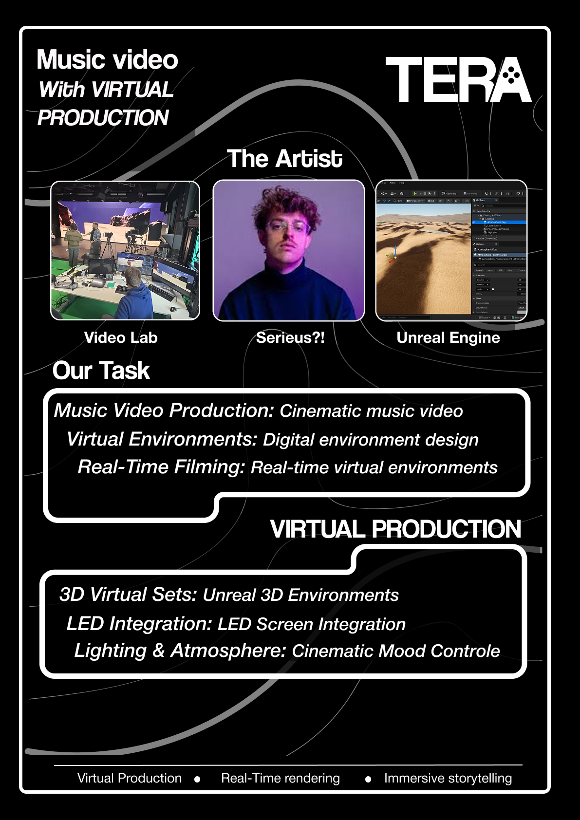
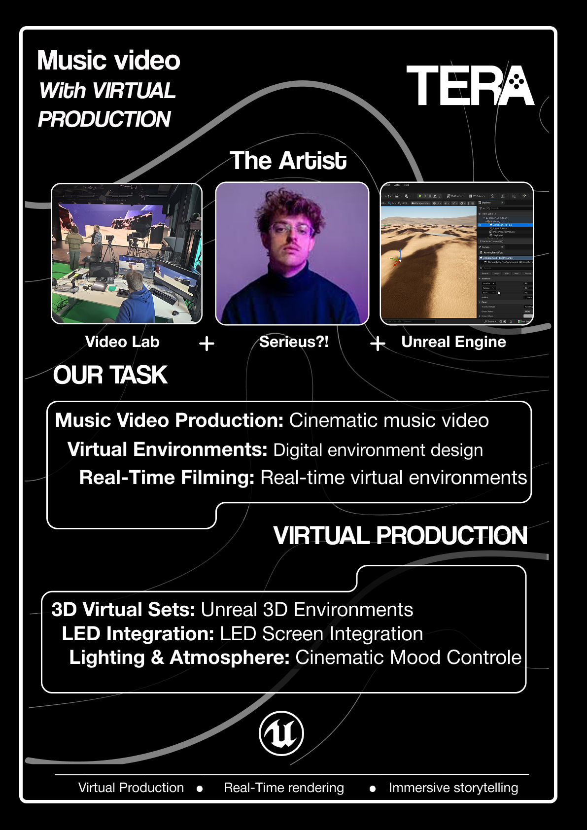
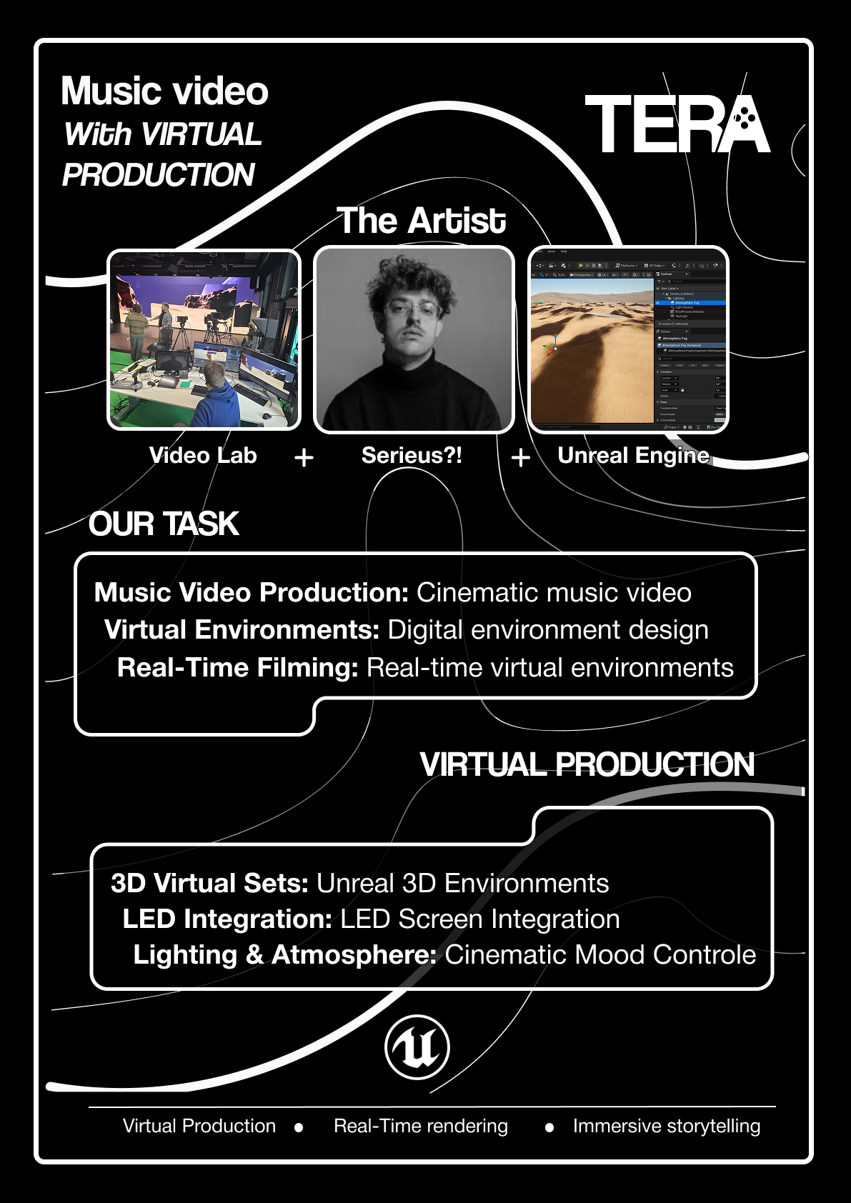
DESCRIPTION
For the music video project, we had to create a concept poster that visually represented our project idea. The goal was to explain what our project was about through design and layout, without using too many words. The poster needed to show the main concept clearly, highlight the artist we were working with, and visually connect the different parts of our production process.
GOAL
My goal was to design a concept poster that communicated our project’s purpose in a clean, creative, and visually interesting way. I wanted people to understand our concept just by looking at the layout, images, and key words , rather than reading long paragraphs.
REFLECTION
This project really showed me how important iteration and feedback are in design. Every version I made got better after I showed it to teachers and classmates. I learned that even small layout changes — like alignment, text size, or how elements connect — can make a big difference. It was fun to see how much the design evolved from my first draft to the final poster. Even though it took a lot of revising, it was worth it because the end result looked professional and clearly communicated our concept.
WHY PROOF BELONGS
This proof fits Learning Outcome 3 because it shows my iterative design process clearly. I went through several poster versions, tested different layouts, backgrounds, and text styles, and improved the design each time based on feedback. Each change brought me closer to a stronger, more effective visual concept. It demonstrates how I use creative experimentation and reflection to refine my work step by step.
ACTION
After selecting a background color, I created an initial poster with the title and images, but my teacher noted it lacked sufficient text. I quickly revised this into a second, more structured version, adding sections like "Our Task," only to be told it was now too wordy for a concept poster. My final iteration placed three key images (Videolab, Artist, Unreal Engine) at the top with short descriptions, and reorganized the remaining content, ultimately incorporating feedback to focus on keywords and bullet points over full sentences.

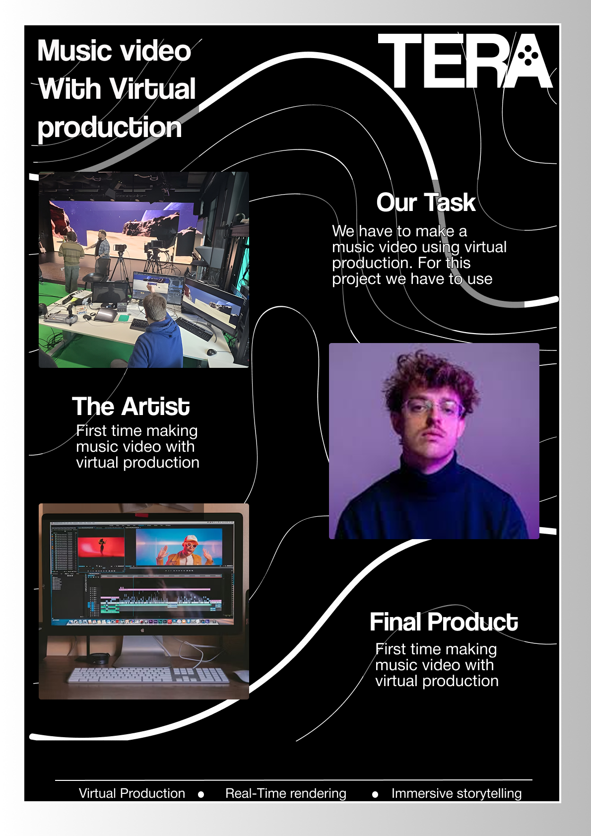
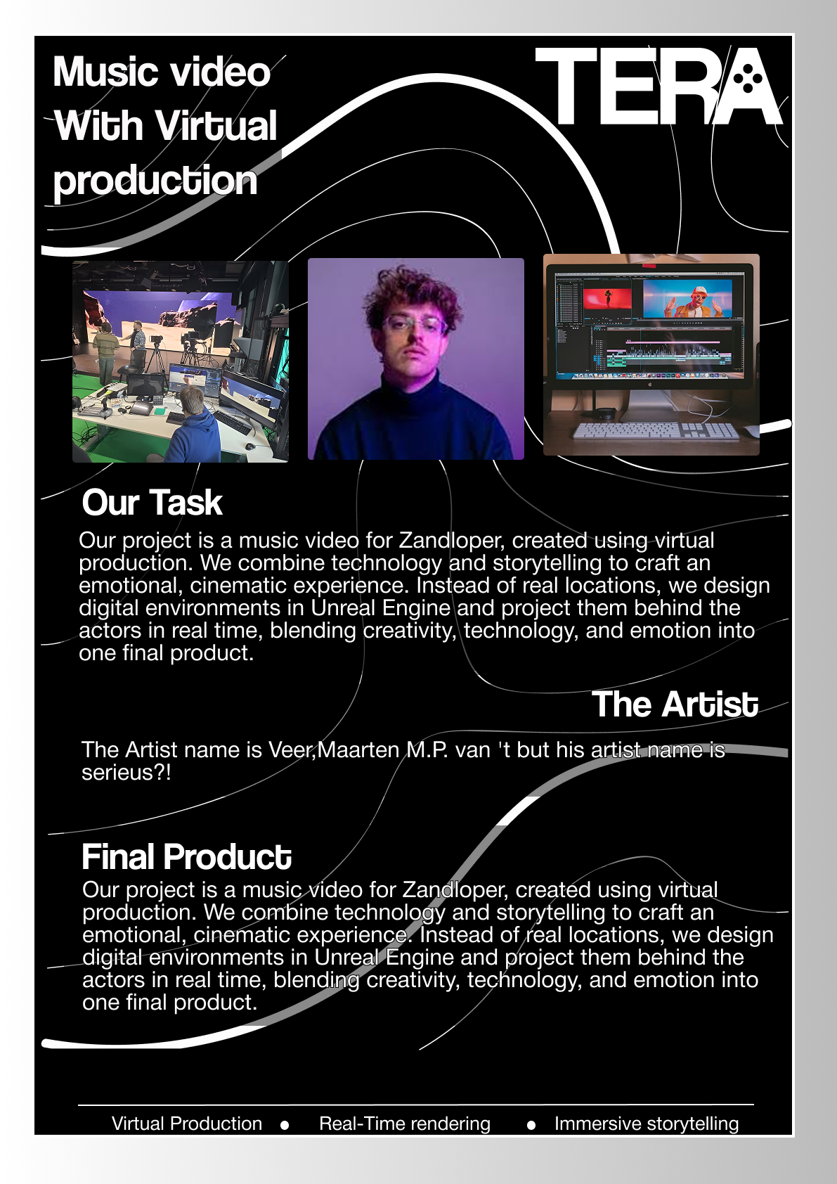
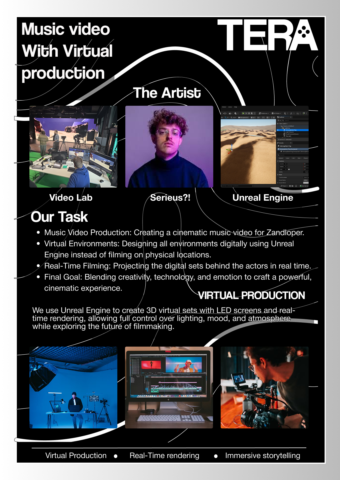
I implemented major structural changes by removing extra images and bullet points, opting for a cleaner layout with bordered sections and bold keywords. After teacher approval, classmates suggested improving element alignment and adding plus signs (+) between the top images to visually link the concepts (Videolab, Artist, Unreal Engine). I added the Unreal Engine and Tera logos, and made a final adjustment to scale down the content for the physical print, completing the final poster.
Final version of Tera poster. If you wish to see the whole process of me making the concept poster please click here to go to the Figma file.
DESCRIPTION
This proof is about the evolution of our music video storyboard. It started as a collaborative effort with the artist, where we decided what was technically possible based on their initial ideas. However, the initial sketches weren't communicating the visual story clearly enough. This led to a necessary second iteration where I used AI to translate the rough concepts into highly comprehensible visual scenes, making the entire narrative much easier to follow.
GOAL
My goal was to create a storyboard that clearly communicated the final vision for the music video, ensuring everyone, especially the artist and the rest of the team, was on the exact same page. When the first version failed to meet this goal, my immediate objective shifted to creating a version that was polished, professional, and instantly understandable to anyone who looked at it, using whatever tools were necessary to achieve that clarity.
REFLECTION
Getting feedback that the first storyboard was confusing was a crucial moment. It forced me to realize that "good enough" sketches weren't going to cut it for a professional document. Using AI to visualize the scenes was a total game-changer. Not only did it make the storyboard look professional and clear, but the client was thrilled with it. This experience showed me the value of not being precious about my initial work and proved that using tools like AI efficiently is a smart part of a modern, iterative design process.
WHY PROOF BELONGS
This strongly demonstrates the required "successive iterations" and the "connections between them" in my development process. The rough sketch storyboard was the first iteration, and the AI-refined version was the second. The connection was the feedback that the first version was confusing, which substantiated the need for the second, more visually clear iteration. This proves a methodically substantiated approach, as the change was based on critical external feedback.
ACTION
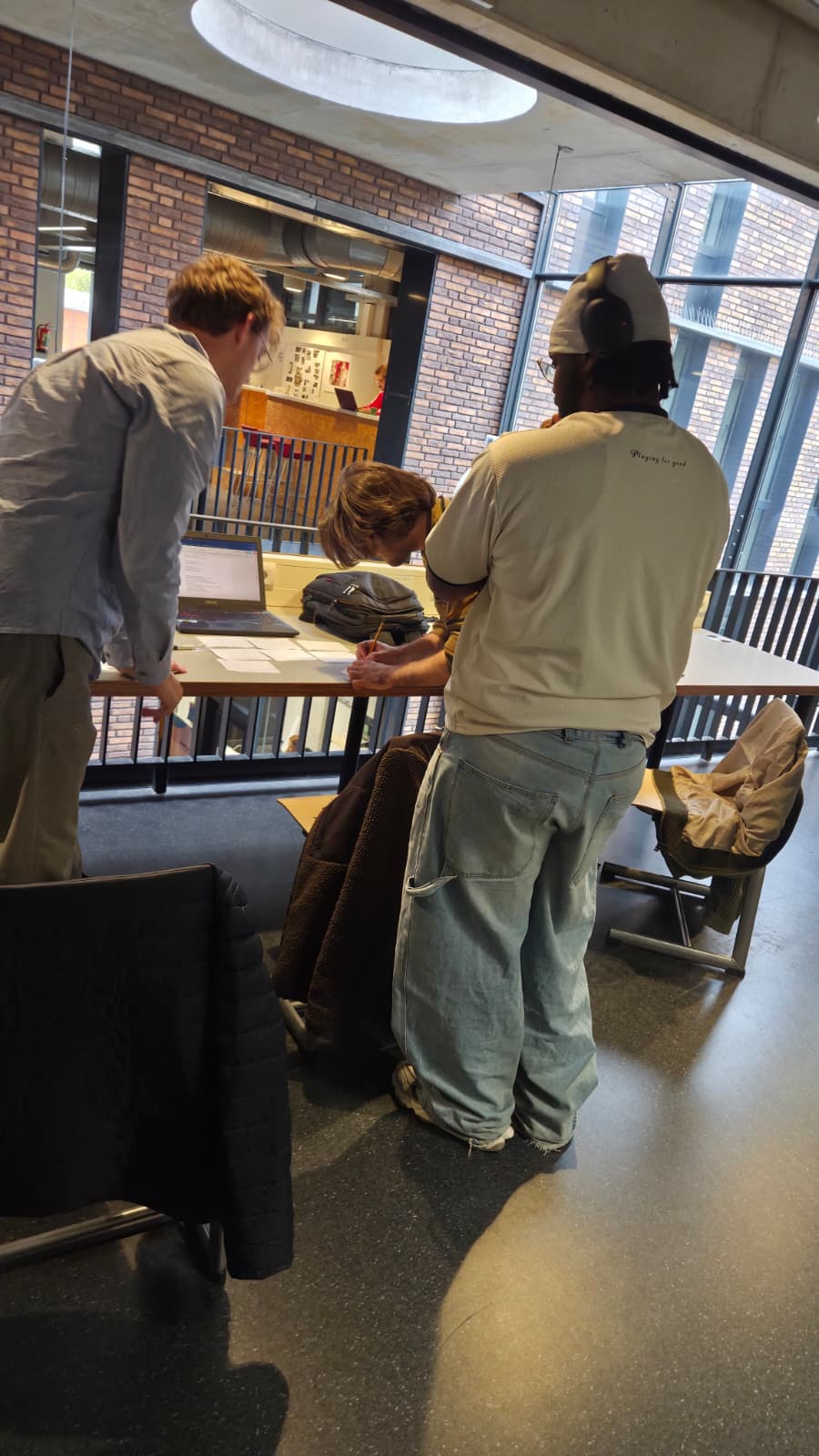
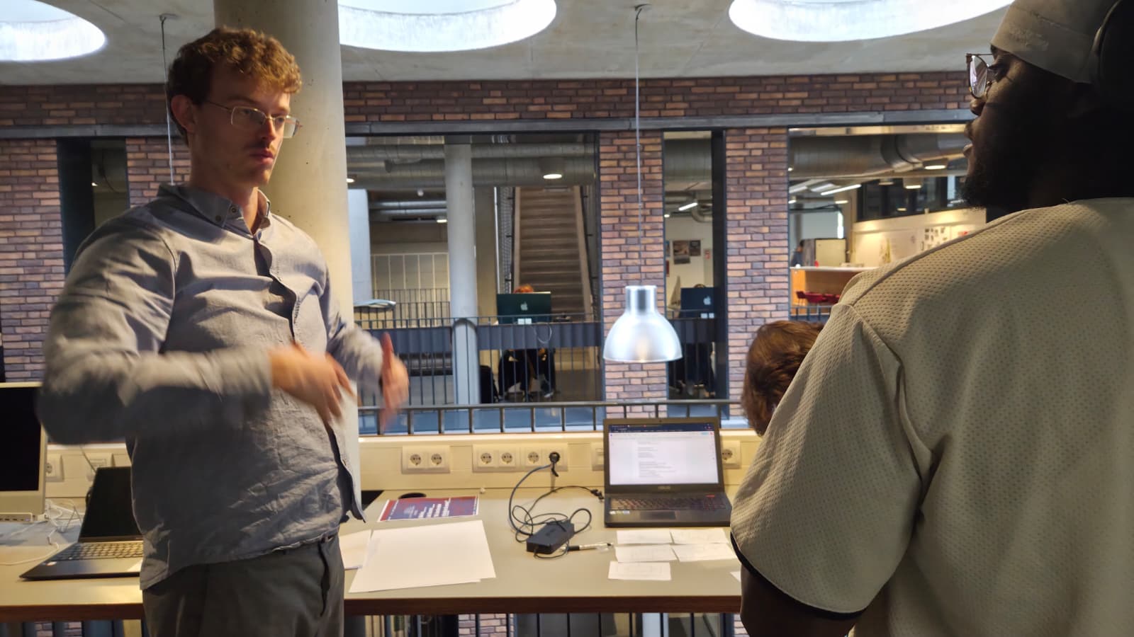
The first step was a collaborative session with the artist, where we went shot-by-shot through their ideas and agreed on what was feasible for the storyboard. After finishing this initial version, I proactively asked for feedback from others. Once I learned the storyboard was not understandable, I immediately initiated the next iteration. I decided to use AI, feeding it the description of each scene to generate high quality, clear visuals that matched our vision. This final, polished version was then presented to the client, who was very happy with the result. In the images below you can see me working on the storyboard. if you wish to see the script with storyboard please click click here If you wish to see the ai storyboard images click here
DESCRIPTION
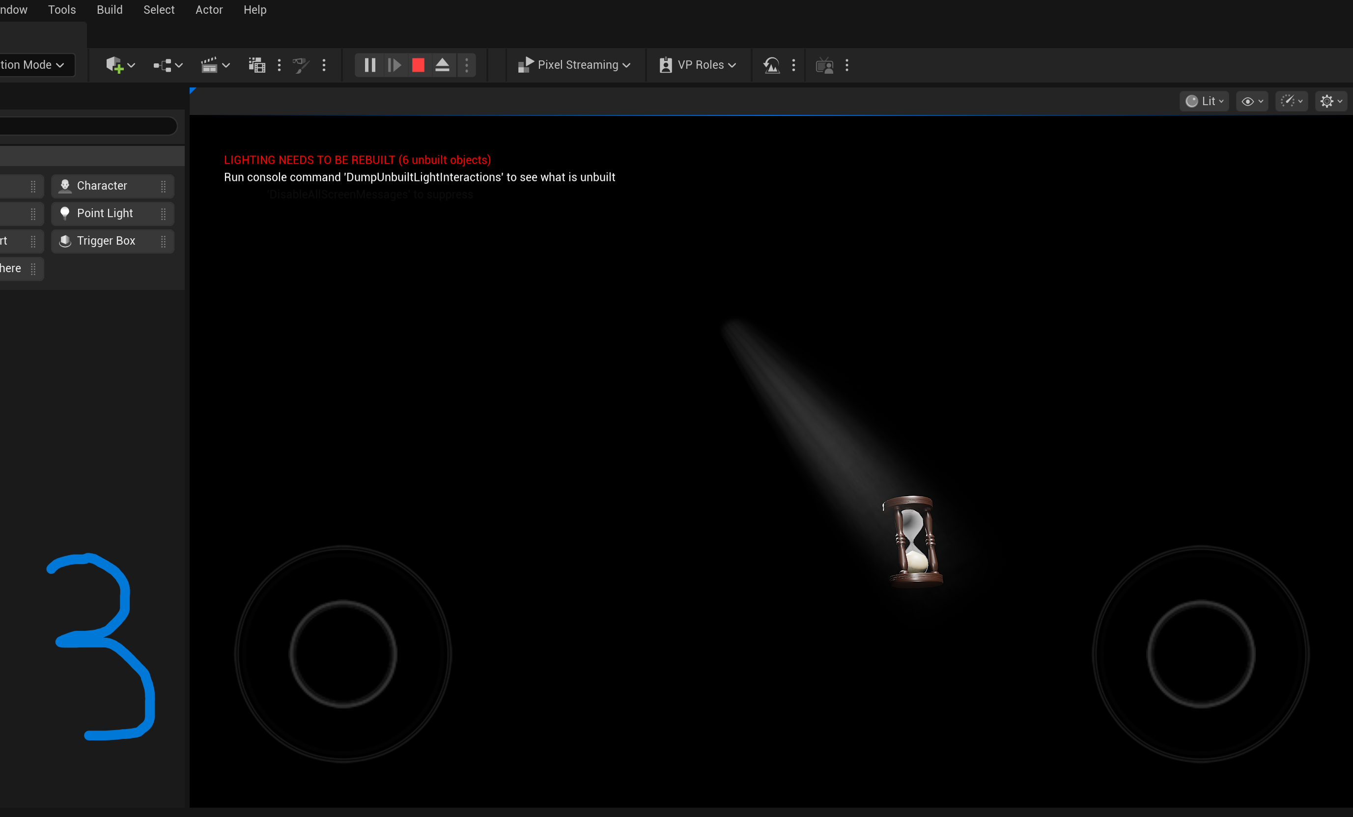
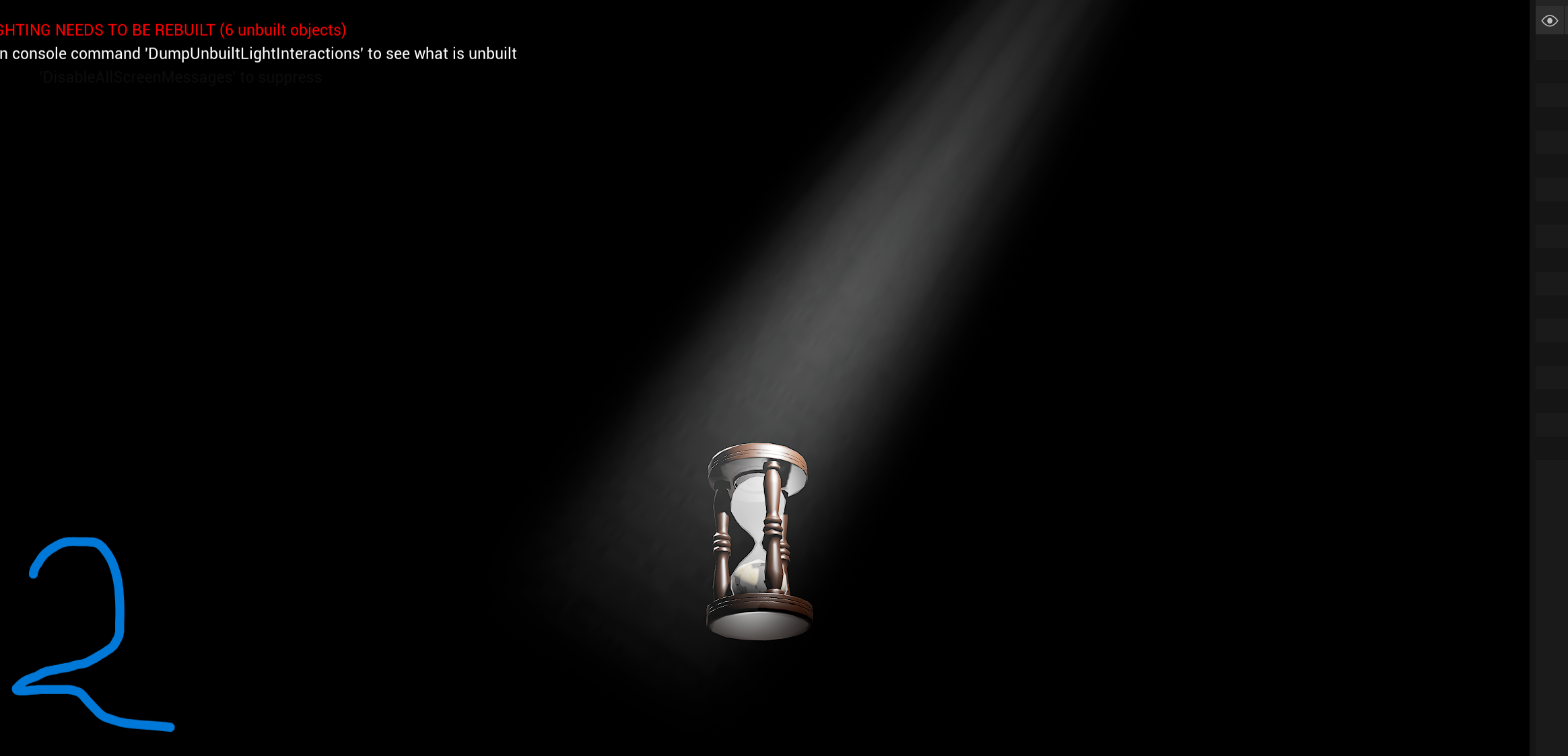
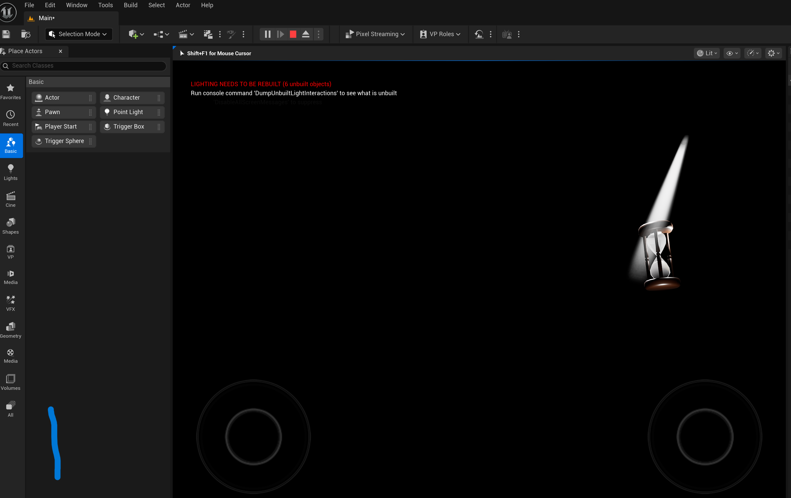
This proof focuses on the development of a specific scene, the hourglass, within Unreal Engine. The main challenge was achieving the right atmospheric lighting, specifically the God Ray effect, to make the scene look professional and moody. After the initial assets were placed (the hourglass model and the first set of God Ray lights), the scene went through a sequence of reviews and adjustments, proving that even a technical build requires several creative iterations to get right.
GOAL
My goal was to create a visually striking and technically sound hourglass scene in Unreal Engine, achieving a cinematic look using God Ray lighting. When the initial attempts were criticized for being too bright, the immediate goal shifted to methodically finding a balance where the light was atmospheric but not distracting or harsh. This meant constantly adjusting the light source and intensity until it felt perfect.
REFLECTION
Working on this scene was a great learning experience, especially since it was my first time really diving into Unreal Engine. It was actually nice that my classmates and teammates were so honest about the brightness; that criticism forced me to try different solutions instead of just settling. Seeing the scene get better with each tweak and finally getting that positive feedback, and especially the client saying it looked "sick," was really rewarding. It definitely reinforced that iterating based on feedback is the best way to polish technical work.
WHY PROOF BELONGS
This clearly shows "successive iterations" and the "connections between them" in a development process. The initial light setup was the first iteration, and the critical feedback about the brightness directly connected and substantiated the need for the second and third iterations, where I tried different lights. The final successful action of physically raising the light source was the culmination of this methodical, feedback-driven process to solve the visual design issue.
ACTION
After setting up the initial hourglass and God Ray assets, I showed the scene to my group and classmates. Their consistent feedback about the light being too harsh prompted me to take action immediately. I searched for and implemented a less harsh light source, but that was still too bright. I then repeated the search and implementation for an even dimmer light, which still wasn't quite right. Finally, based on observing how light works in reality, I decided to physically raise the God Ray light source higher up in the scene, which finally dispersed the light enough to look soft and atmospheric, which satisfied both my peers and the client.